Hale Moana
Brand identity, packaging design, illustration
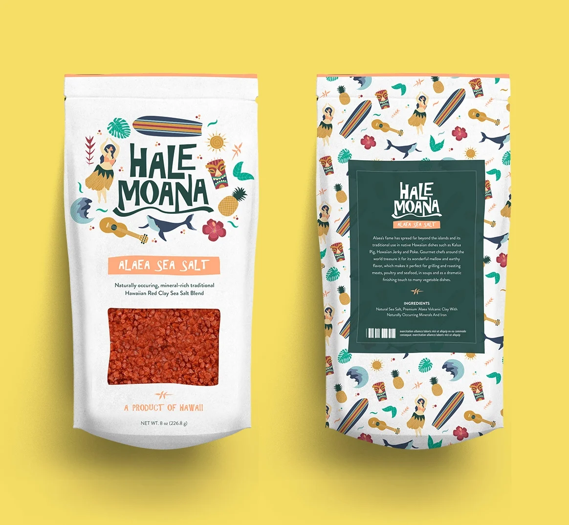
One of the assignments for my Brand Identity Design class at SVA was to create a fictional brand - starting from the creative brief rolled out to specific visual components - centered around a specific food/ingredient that was to be assigned to us at random. I got sea salt, which gave me the idea to create a mid-priced and mass-distributed Hawaiian seasoning line called Hale Moana (House by the Sea).
Since it was to be a mass-produced line, visually, it needed to be down-to-earth and relatable for the everyday consumer. I thought of integrating very classic and stereotypical Hawaiian imagery into the brand look and feel; basically, visual elements that would be top-of-mind whenever someone mentioned the word “Hawaii” - a hula girl, a ukulele, surfboards, pineapples, etc.
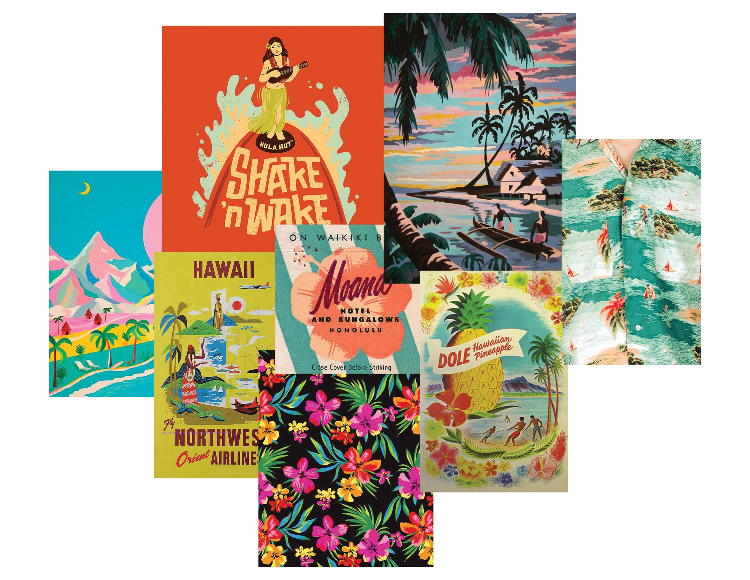
Moodboard (images grabbed from random sources - if you know the owners/illustrators please let me know so I can give proper credit.)
Style-wise, I was inspired by the bright and bold maximalism in vintage Hawaiian posters and traditional Hawaiian patterns. As for typography, I knew I wanted thick, chunky letters contrasted with bright, fun and flowy illustrations.
Initial logo sketches drawn by hand
Eventually settled on this study
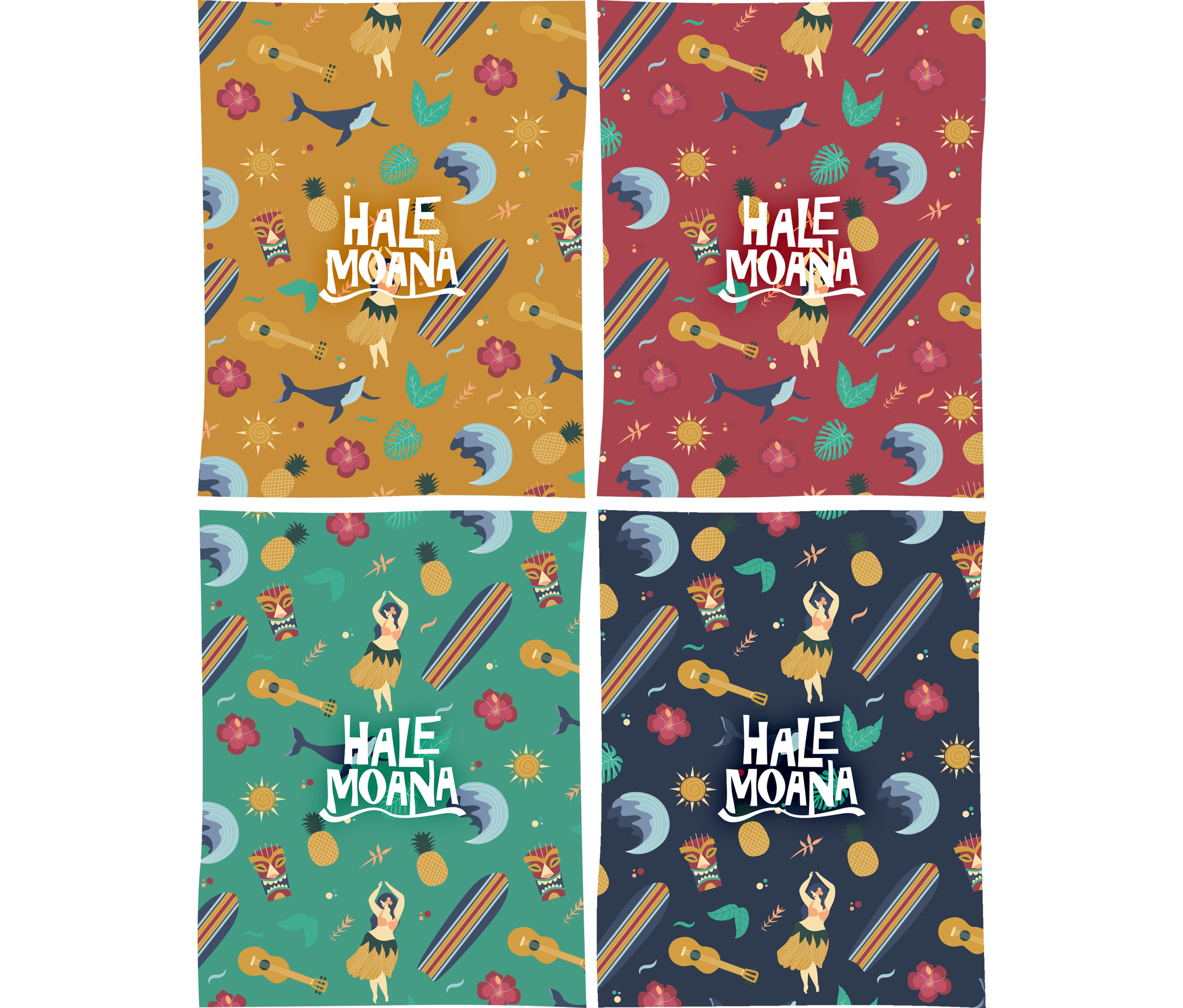
A pattern was also derived from the illustrations
A range of Hawaiian sea salts was to be the first offering of the brand.
Hawaiian sea salts come in all sorts of varieties. The unique colours of the products stood out to me so I instantly knew I wanted to come up with a packaging design that would highlight those colours.


